


The Brand
Lytup is an energy storage innovator committed to bridging the gap in energy accessibility for underserved communities. Through its pioneering Battery Energy Storage Systems (BESSs), it is revolutionizing how electricity is delivered to remote areas. Its focus on secure, intelligent, and sustainable energy solutions empowers these communities with reliable power, fostering economic development and improving quality of life. With cutting-edge technology and a dedication to collaboration, Lytup is leading the charge in making clean energy accessible to all, regardless of location or circumstance.
The Problem
Despite its groundbreaking technology, Lytup lacks a defined brand identity. Without a clear visual representation, Lytup struggles to establish its presence in the market and differentiate itself from competitors. There's a pressing need to develop a cohesive brand identity that communicates Lytup's values, vision, and unique position in the energy sector.
Project Goals
1. Develop a unified design language that effectively communicates Lytup's identity, making it easily recognizable and memorable.
2. Create a brand logo and visual identity that reflects Lytup's innovative spirit, modern approach, and commitment to sustainability. The new branding should resonate with Lytup's target audience and position the company as a leader in the energy storage industry.
3 . create a UI/ Website design that aligns with brand.


Typography
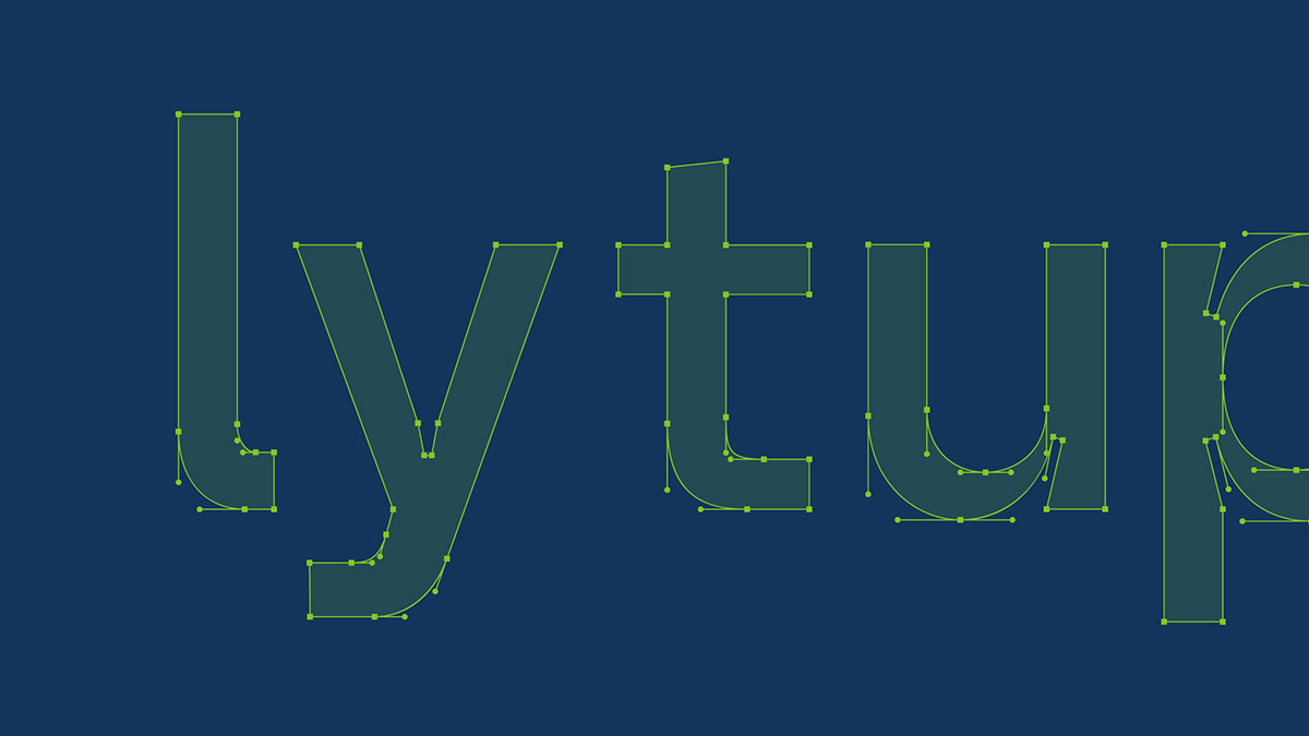
"Random Grotesque" is a versatile sans-serif typeface that combines the sleekness of Helvetica with its own distinctive charm. Noted for its ink traps, it offers a unique appeal suitable for digital products, posters, logos, headings, and text of various sizes, meeting all the criteria for an ideal brand typeface.


Colours
Lytup's carefully curated color palette speaks volumes about it's commitment to sustainability and innovation. Each color, from the Verdant Glow Green to the Radiant Ember Orange, carries its own significance, reflecting growth, stability, purity, and vitality. Together, they create a visually captivating brand identity that communicates Lytup's dedication to a brighter, more sustainable future powered by solar energy.


Brand Expression
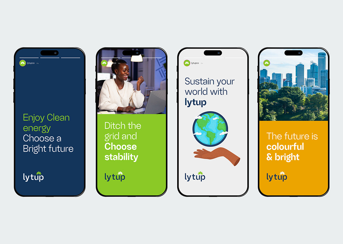
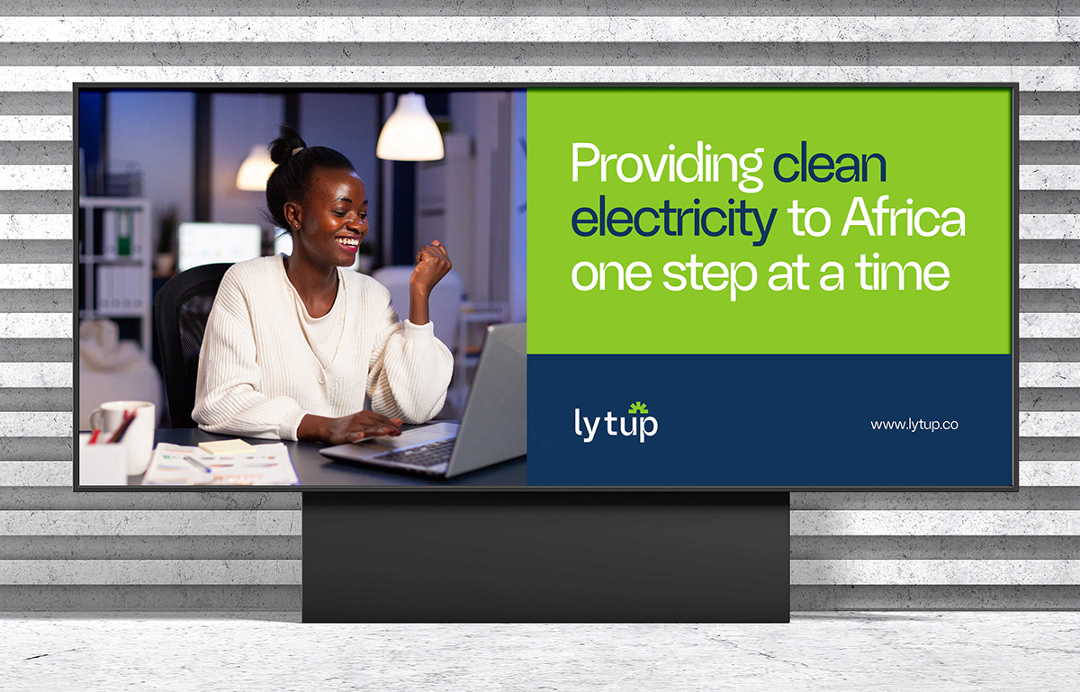
Lytup's brand colors, typography, and photography blend seamlessly, conveying its message across various platforms. The logo, a symbol of the brand's identity, is prominently featured on the app icon, website, social media icons, and marketing materials, accompanied by carefully selected imagery. Social media marketing maintains this consistency through posts with a unified brand voice, tone, typography, and photography style. Additionally, Lytup extends its presence to physical items like stationery and merchandise, ensuring a comprehensive brand experience. Out-of-home advertising further boosts Lytup's visibility, reaching both online and offline audiences effectively.


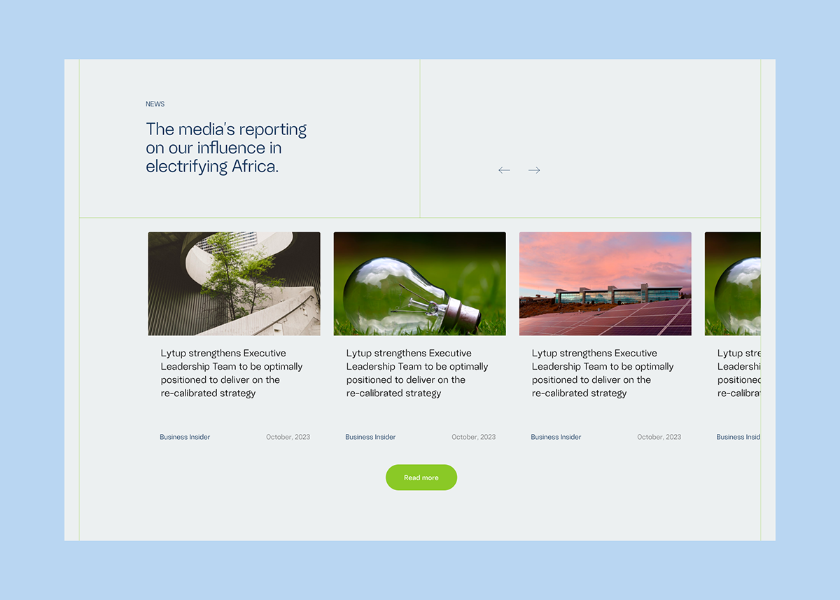
UI / Website
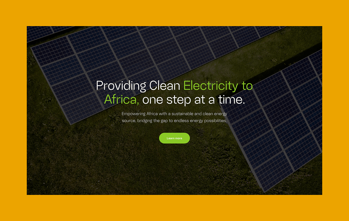
The team crafted a UI/website design for Lytup that encapsulates the brand's essence of sustainability and innovation while ensuring a seamless user experience. Key design goals include conveying Lytup's values, highlighting product features, and encouraging engagement. The design features a captivating homepage, detailed product pages, an about us section, and a user-friendly contact page. Overall, the design aims to attract, inform, and convert visitors, ultimately contributing to Lytup's growth and success in the energy storage market.


Credits
Dan Praise — Project lead, Brand Design, Launch Supervisor
Josh Oladiti — UI / Web Design
Damilola Olaleye — Brand Design / Implementaton
Josh Oladiti — UI / Web Design
Damilola Olaleye — Brand Design / Implementaton
Interested in working with us?
Send a private message or mail here


